In many churches today, pastors aren’t just expected to be the “spiritual shepherds of the flock” but also (somehow) we’re expected to understand how to:
- Grow church revenue
- Manage a giving campaign
- Develop web pages to receive donations
Personally, I’m not at my best in those situations… but I’ve learned—through trial and a lot of error! I have seen how a well-designed, effective donation page can make a significant improvement in your online giving (don't worry, I'll take you through some examples).
NOTE: the tech infrastructure supporting your online giving is not something to mess around with. Be sure your church is using one of the best church giving software tools.
Ok, let's jump right in!
What Is A Donation Page?
An online donation page is a dedicated space within your church’s or non-profit website where church members and visitors can easily make financial contributions of any gift amount to your church ministries!
Think of this as the modern-day offering plate—but online, so it's always ready and always welcoming.
A well-designed donation page is more than just a point of transaction. It is a reflection of your church's values. It can be an asset for fostering a sense of community within your church and speaks volumes to the community outside of it.
Why An Effective Donation Page Matters
The percentage of Christians who give regularly is generally decreasing across North America. In this climate, an effective donation page can help increase recurring, regular giving. This can bring much-needed sustainability and predictability to your church's revenue.
Your church donation page can also be a major part of your communication strategy with your congregation. It can:
- Clearly present your church mission and the impact of each financial gift received
- Reflect your church's values, and align with the principles of church stewardship.
- Be a space where you share stories of transformation, made possible by donors
- Highlight how recurring donations enable your church’s purpose and mission
Your church shouldn’t just hear about the principles of biblical giving from short offering messages on Sunday morning; they should also be reflected on the online donation page.
Benefits of a Great Donation Page
- Increasing Donations: an excellent donation page with clarity on the church or the organization’s mission makes giving easy, leading to more potential donors!
- Improved Connection: a well-crafted donation page makes it easy for church members to give and encourages them to donate again.
- Healthier Finances: an effective donation page connects with church financial systems, making it easier to track donation amounts.
-

Wix
Visit WebsiteThis is an aggregated rating for this tool including ratings from Crozdesk users and ratings from other sites.4.4 -

Tithe.ly
Visit WebsiteThis is an aggregated rating for this tool including ratings from Crozdesk users and ratings from other sites.4.7 -

WordPress
Visit WebsiteThis is an aggregated rating for this tool including ratings from Crozdesk users and ratings from other sites.4.6
What’s Necessary For A Great Donation Page?
As you're creating or adding a donation page to your church website, keep it inviting, clear, and meaningful. Make it simple, secure, and inspiring so donors are motivated to give. Keep the following priorities front and center:
1. User-Friendly Design:
The page should be easy to navigate, with a straightforward layout that guides visitors through the donation process without hassle. This helps recurring and potential donors complete their online donation forms quickly and without frustration.
2. A Clear Call to Action:
Include a noticeable button or link that tells visitors exactly what to do, like “Donate Now.” This helps donors know where to click and makes the donation process smooth. Bonus points also if there are sharing buttons allowing donors to share the link with others so they can give!
3. Secure Payment Processing:
Use reliable and safe methods to handle PayPal or credit card payments so donors feel confident their information is protected. This builds trust and encourages more people to donate.
4. Mobile Optimization:
Make sure the donation page looks good and works well on smartphones and tablets. Many people use their phones for everything, so it’s essential they can easily donate from their devices.
5. Easy Access to Information:
Provide clear details about your church and organization’s mission and how donations are used. Transparency about your goals and finances builds trust with donors. If you have an active social media presence showcasing your ministries, include links to these profiles so potential donors can easily see your work in action.
Donation Pages Worth Emulating:
I have gathered some standout examples from churches that really know how to make giving easy, inspiring, and impactful. Take a look at these examples to get some creative ideas and practical features that you can incorporate into a great donation page.
Rock Church (San Diego, California)
This large, dynamic church is focused on evangelism, discipleship, and community outreach, and is pastored by Miles McPherson. Here’s a look at their online donation page:
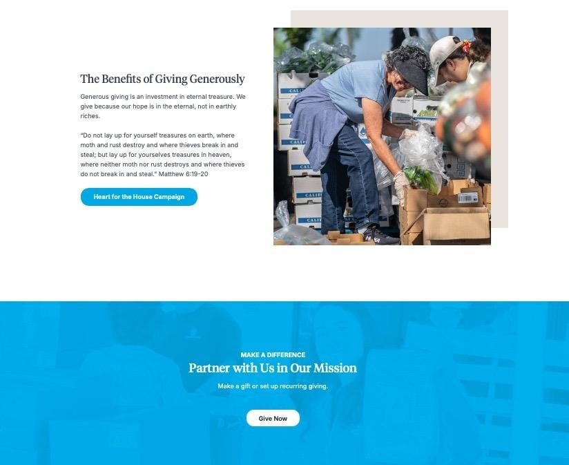
How well does this example stack up to our five guidelines?
- User-Friendly Design: The donation page is easy to navigate, with a clear path to make contributions on the donation form.
- Clear Call to Action: A prominently placed "Give Now" button is easy to find.
- Secure Payment: Payments are securely processed through Tithe.ly, ensuring a safe transaction experience.
- Mobile Optimization: The page is optimized for seamless navigation on both desktop and mobile devices.
- Easy Access to Information: Accessing additional church information is simple and straightforward with just a few clicks.
This is a great example!
Green Valley Church (San Diego, California)
This welcoming and family-centered church is committed to biblical teaching, community, and spiritual growth. Here’s how they represent their culture on their donation page:
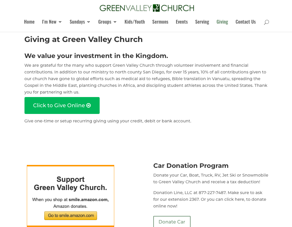
How well does this example stack up?
- User-Friendly Design: The donation page is simple, minimalistic, and easy to navigate.
- Clear Call to Action: A prominent "Click to Give Online"donation button is easy to find. (There are also clear options for donating a car, boat, or RV in exchange for a tax-deductible receipt.)
- Secure Payment: Payments are securely processed through Tithe.ly, providing a safe transaction experience.
- Mobile Optimization: The donation form is very easy to navigate on both desktop and mobile devices.
- Easy Access to Information: Additional church information, including details about the church's history and how 10% of funds support global efforts, is easily accessible with just a few clicks.
This is a great example to follow!
Third Coast Church, Corpus Christi, Texas
This modern, coastal church is passionate about connecting people to Jesus through authentic worship and community impact. Here’s how their donation page looks:

How well does this example stack up to our five guidelines?
- User-Friendly Design: The donation page is straightforward, minimalistic, and easy to navigate.
- Clear Call to Action: The "Give Online Now" donation button is prominently displayed and easy to spot.
- Secure Payment: Payments are processed securely through Tithe.ly, ensuring a safe transaction experience.
- Mobile Optimization: The donation form is easy to navigate for donors on both desktop and mobile devices.
- Easy Access to Information: It’s simple to find additional information about the church, although more details about the ministries they support would be appreciated.
This is a great example!
St. Peter's Evangelical Lutheran Church (Lancaster, Pennsylvania)
St. Peters’s is a historic congregation rooted in Lutheran traditions, offering worship, education, and service to the local community. Here’s their online giving page:
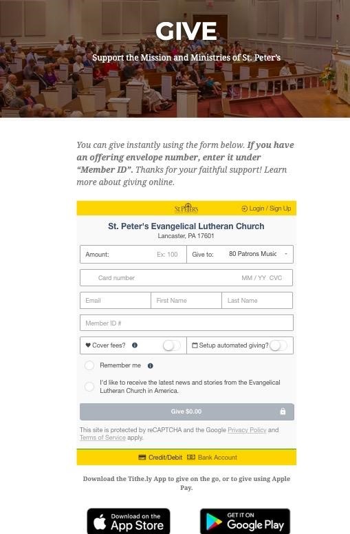
How does this stack up to our five guidelines?
- User-Friendly Design: The landing page is straightforward but is less engaging than some of our others.
- Clear Call to Action: The call to action donation button is fairly clear (but may be lost in the shuffle, especially for less tech-savvy users.)
- Secure Payment: Payments are securely processed through Tithe.ly, ensuring a safe transaction experience.
- Mobile Optimization: The landing page is navigable on both desktop and mobile devices, but its wordiness requires some scrolling for donors and for new donors, so this could be a challenge.
- Easy Access to Information: The payment information box includes a dropdown menu to select a ministry, though it lacks descriptions.
This example gets some things right - but there are definitely room for improvements. All that being said: for smaller churches, online donation pages are not always as crucial - largely because of the close personal relationships that are often present. So, while this design may not win awards, it works just great for what this church needs.
Loft City Church (Richardson, Texas)
This vibrant, diverse church is built around on gospel-centered living, discipleship, and serving both local and global communities. Here’s their online giving page:
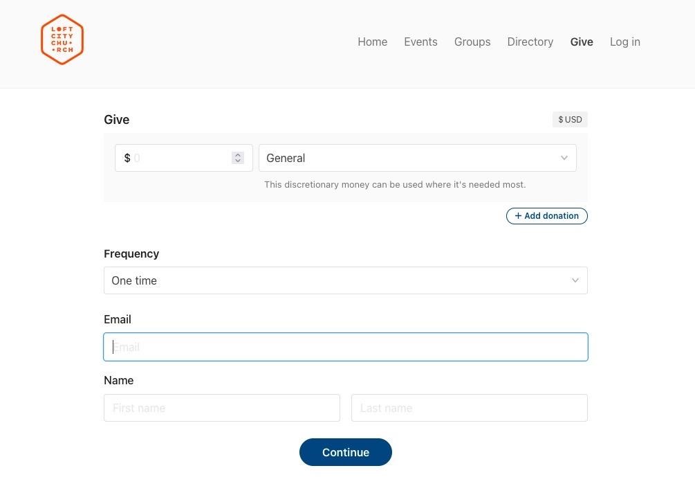
This page highlights both the pros and cons of simplicity. While it may not engage new donors with the church's mission, it benefits regular givers by offering a straightforward dropdown menu with 4-5 options for giving.
I really appreciate that new donors can make a one-time donation without setting up an account. This is appealing for those who want to donate quickly without extra steps.
- User-Friendly Design: The landing page is simple and straightforward, but it lacks information on how the church uses donations.
- Clear Call to Action: The page offers various giving options, including online, by mail, Text-to-give, and through the Church Center app. Navigation is easy.
- Secure Payment: Payments are securely processed through Stripe.
- Mobile Optimization: Donations are directed to the Church Center app, though you can continue in your browser. The prompt to download the app might deter some donors.
- Easy Access to Information: The rest of the church website is easily accessible, providing more information when needed.
Eight Best Practices For Donation Page Design
Now, if you want to build a donation page for your church website, you don't want it just to look good, but you want the donation form to also inspire generosity, which not only draws the donor into your church's mission, but keeps them coming back! Here are some best practices to consider:
1. Keep it Simple.
Keep it clean and easy to use! Avoid clutter and make the donation process intuitive. Clear headings and fewer distractions on the donation form itself also help donors stay focused on giving.
2. Highlight the Call to Action.
Make your “Donate Now” button easy to find. It should stand out and be placed where everyone can see it.
3. Tell Impactful Stories.
Share heartfelt stories from your church ministries and testimonials to connect with donors. Highlight how their contributions make a real difference with examples and success stories.
4. Optimize for Mobile Devices.
Ensure the page works well on phones and tablets. A responsive design that adjusts to different screens improves usability and the overall donor experience.
5. Ensure Secure Payment Options.
Clearly show that transactions are secure. Display SSL certificates and use trusted payment processors to boost your church’s credibility.
6. Simplify Navigation.
Make it simple for donors to find more information about your church, specific projects, or contact details. Use clear links and a logical layout.
7. Enhance Visual Appeal.
Use high-quality images and graphics that match your church’s brand and message. A visually appealing page can attract donors and enhance their experience.
8. Offer Flexible Donation Choices.
Offer various donation options, like preset amounts, custom amounts, and recurring monthly donations. This flexibility lets donors choose how they want to contribute.
Success Stories
Here are two churches that made some changes to their website for donations.
Vale Church
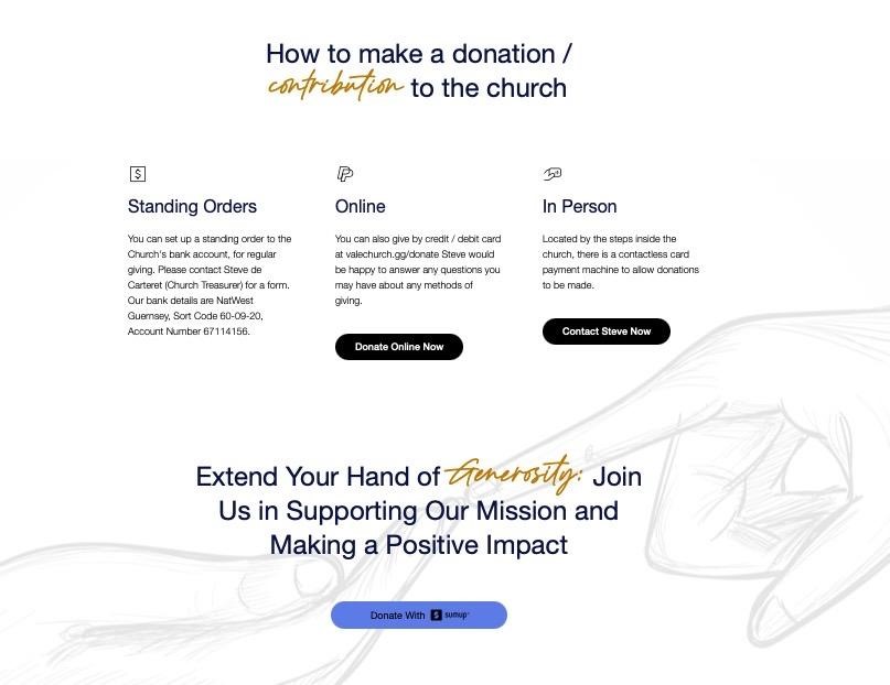
Vale Church (a small local parish) was used to a WordPress site which was hard to update, and left donors and new visitors frustrated. So, they teamed up with a design company to build a simple and user friendly site for their less than tech-savvy church members. The new site, and new donation page, were simple, streamlined, and easy to access. As a result, their online giving increased, as did the impact of their online presence.
Here’s a quick look at their donation page:
First Presbyterian Church
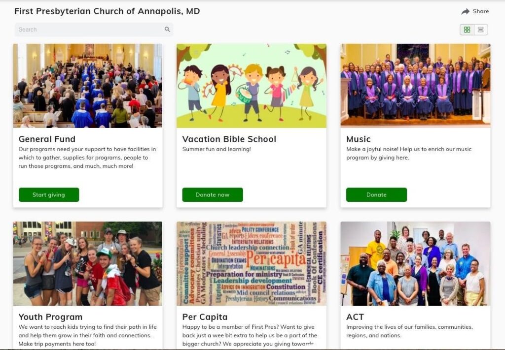
First Presbyterian Church in Annapolis had ‘made do’ with a simple donation page for a long time. Finally, they pulled the trigger on an upgrade. During the redesign process, they prioritized several things:
- Direct giving: they wanted to provide ways for donors to give directly to specific ministries and causes.
- Multiple ways to give: they wanted to make it as easy and convenient for their members to give.
- Simplicity: they wanted a clean, uncluttered design.
Originally the church had a basic donation page but then did an upgrade. The biggest change they made was that they provided detailed information about each ministry, allowing members and potential donors to easily find the causes that matter most to them.
Here’s what they came up with:
Join For More Practical Insights
Looking for help sorting out church grants, church grant management software, building church websites, or handling critical church members?
Subscribe to The Lead Pastor newsletter for the latest insights and strategies to help your church thrive. Join our community of church leaders and stay informed with valuable updates straight to your inbox!


