
25 Church Logos for Inspiration & Studying 2026

Most church logos are either trying too hard… or not trying at all. Either way, they end up forgettable. But a great logo? That’s different.
The right logo is not just clean and modern—it tells the truth about who you are. It says something before you ever say a word from the pulpit. It works on a T-shirt, your church website design, and your offering envelopes.
My goal for this list of top church logos of 2026 is not to sell you a template. Not to overwhelm you with branding jargon. Just to spark some ideas that’ll help you build something honest, usable, and built to last.
Let’s dig in.
What Makes a Great Church Logo?
The best church logos do three things really well:
First, they’re clear. You don’t have to squint or guess what you’re looking at. They stand out in a sea of generic crosses and clipart doves.
Second, they’re transferable. Whether it’s a bulletin, a hoodie, or your Facebook profile pic, a good logo works anywhere you put it. That kind of flexibility isn’t optional anymore—it’s essential.
Third, they reflect who you are. A great logo doesn’t just look nice; it feels like your church. It gives people a sense of your voice, your values, your vibe—before they ever walk through your doors.
25 Church Logos of 2026
Life.Church – 8.7 / 10

The swooping “LC” suggests movement and shared space, capturing their digital-first, life-together mission in a single stroke. Black and white options keep branding costs down, while the icon alone is instantly recognizable. The logo is flexible and holds up across platforms.
- Clarity [9 / 10]: Two shapes merge instantly, no second take needed.
- Transferability [9 / 10]: Thick curves hold up from silk screen to LED wall.
- Honesty [8 / 10]: Overlapping forms bake in the message of togetherness.
Grace United Methodist Church – 7.0 / 10
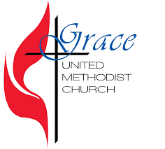
The classic UMC flame gets a remix here. Elegant script softens the tone while honoring denominational heritage. It sings on larger signage but struggles when shrunk to avatar size, as the script needs some room to breathe for clarity and impact.
- Clarity [7/ 10]: Script needs some room to breathe.
- Transferability [7 / 10]: The flame holds up: typography less so.
- Honesty [7 / 10]: Methodist identity respected, with a personal touch.
Christian Community Church – 8.3 / 10
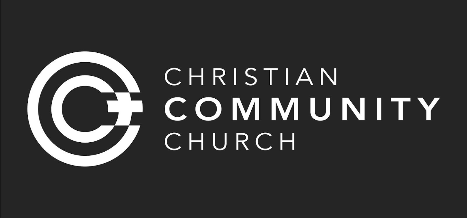
Three nested Cs wrap a central cross, making Christ-centered community obvious without any guesswork. Thick rings look great on merchandise and hold their shape across formats. The logo’s bold concentric lines suit every platform and represent closeness and Christ focus.
- Clarity [8 / 10]: The triple-C concept reads on first glance.
- Transferability [9 / 10]: Bold concentric lines suit every platform.
- Honesty [8 / 10]: The message of closeness and Christ focus is clear.
One City Church – 8.3 / 10
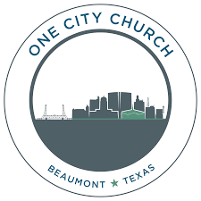
A city skyline fits into the church’s initial, anchoring the logo in its urban mission. Multiple variations work across all platforms without losing identity. The letter and skyline combination clicks fast and their local heartbeat and vision come through strong.
- Clarity [8 / 10]: Letter and skyline combo clicks fast.
- Transferability [8 / 10]: Blocky shapes hold up across printing methods.
- Honesty [9 / 10]: Their local heartbeat comes through strong.
Pilar Igreja – 9.0 / 10
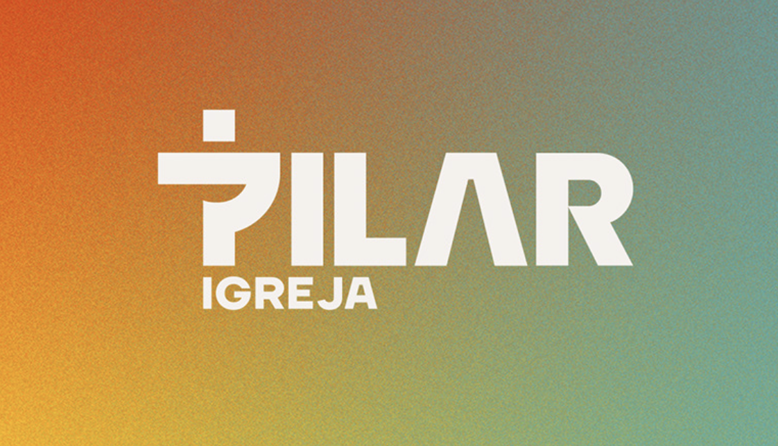
A pillar-shaped P doubles as a cross, saying it all: structure and gospel at the center. Clean lines and monochrome style keep the design versatile and strong. The “church as pillar” metaphor is obvious and lands perfectly for this community.
- Clarity [9 / 10]: Pillar-cross concept is obvious, in a good way.
- Transferability [9 / 10]: Crisp lines adapt to every format.
- Honesty [9 / 10]: “Church as pillar” metaphor lands perfectly.
The Church at CW – 8.3 / 10
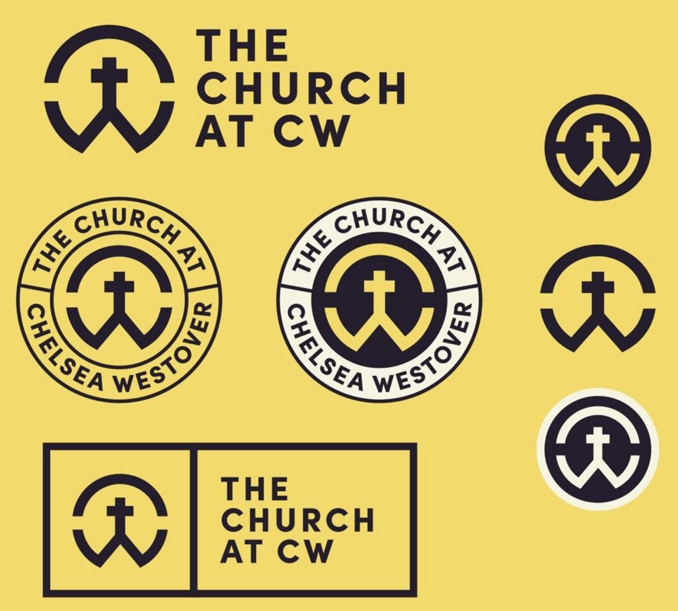
A monogrammed CW path heads toward a cross, all set inside a circular badge. The black and white color scheme holds up everywhere, and the path and cross are readable even at small sizes. Journey imagery fits the mission and keeps things clear.
- Clarity [8 / 10]: Path and cross are readable even at small sizes.
- Transferability [9 / 10]: Solid ring performs well across formats.
- Honesty [8 / 10]: Journey imagery fits the mission.

Cedarcrest Church – 9.0 / 10
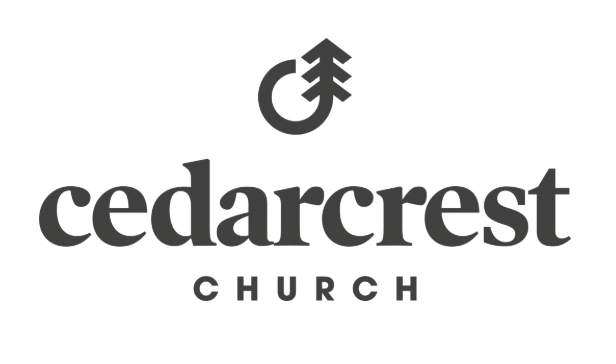
A single stroke becomes both a “C” and a cedar tree, wrapping name, mission, and tone into one. The design is simple, clear, and human—not techy. The C-tree hybrid is instantly recognizable and the tree metaphor fits the church’s mission like a glove.
- Clarity [9 / 10]: The C-tree hybrid is instant.
- Transferability [9 / 10]: Minimal line adapts cleanly.
- Honesty [9 / 10]: The tree metaphor fits like a glove.
Harvest Church – 8.0 / 10
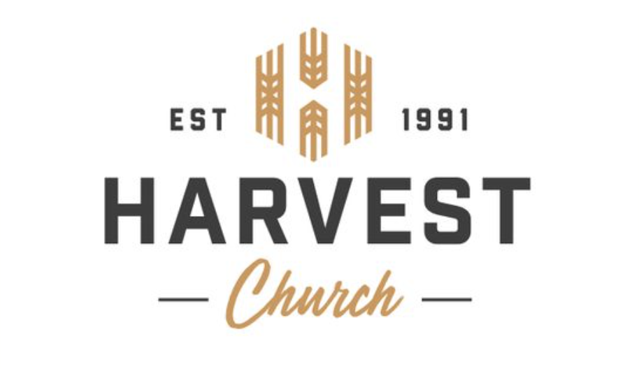
Wheat stalks shape an “H,” signaling abundance without veering into clip-art territory. Earth tones give flexibility across seasons and merch. The wheat-shaped H is immediate, and strong geometry holds up on any surface, clearly communicating the gathering and harvest message.
- Clarity [8 / 10]: Wheat-shaped H is immediate.
- Transferability [8 / 10]: Strong geometry holds up on any surface.
- Honesty [8 / 10]: Gathering and harvest message clear.
Limitless Church – 8.3 / 10
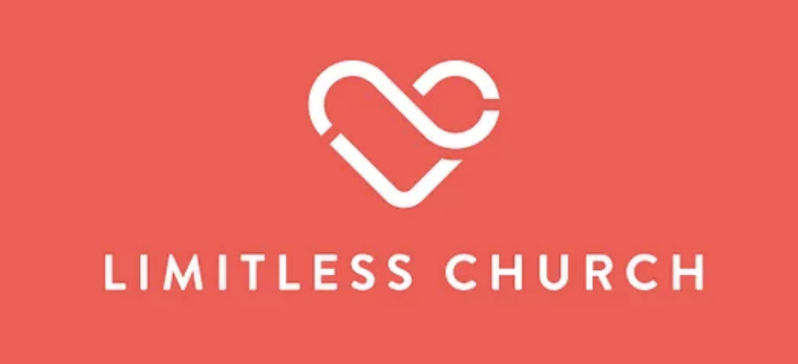
An infinity loop becomes a heart, showing grace and love in a line simple enough for any to recognize. The two-color design keeps the message bold. Heart and infinity are instant, and “no limits on grace” lands clearly.
- Clarity [8 / 10]: Heart and infinity loop neatly intertwined.
- Transferability [9 / 10]: Thick loop works on all formats.
- Honesty [8 / 10]: “No limits on grace” lands clearly.
Concord Church – 8.3 / 10
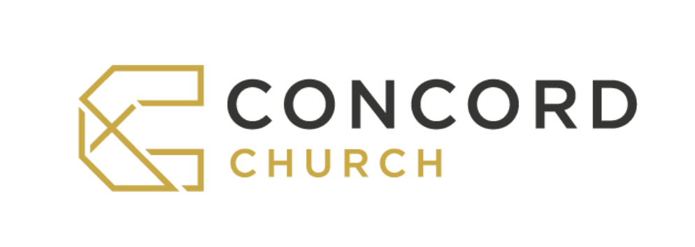
A bold “C” cut by a cross mimics the church’s industrial bones. The whole logo reads solid and stable, just like the building itself. The cross inside the C reads fast, and the square shape fits well everywhere, visually declaring their space.
- Clarity [8 / 10]: Cross inside C reads fast.
- Transferability [8 / 10]: Square shape fits everywhere.
- Honesty [9 / 10]: It’s their space, in visual form.
Decatur City Church – 8.3 / 10
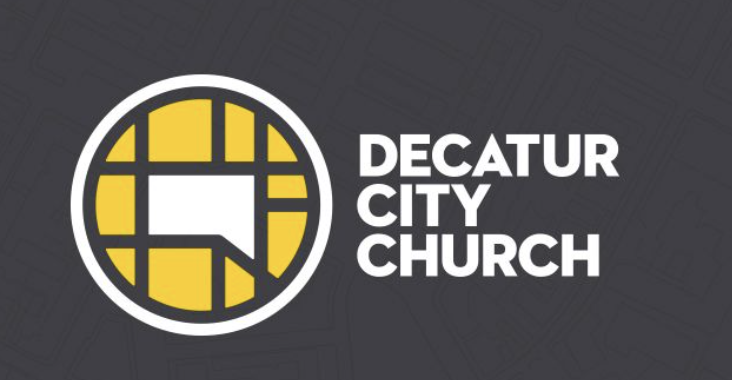
A city grid becomes theology—love your place. Bright yellows and black lines keep it local and legible. The grid reads clean, the blocks hold on any medium, and the place-based icon drives the brand, making the church’s local identity clear.
- Clarity [8 / 10]: Grid reads clean.
- Transferability [8 / 10]: Blocks hold on any medium.
- Honesty [9 / 10]: Place-based icon drives the brand.
Trinity Presbyterian San Diego – 7.3 / 10
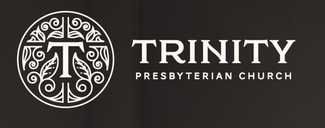
A floral seal breaks the mold, but fine detail vanishes when small. The bold serif T helps with clarity, and forward colors offset the old-school form. While leaves get muddy when tiny, the two-color approach helps with transferability across formats.
- Clarity [7 / 10]: Leaves get muddy when tiny.
- Transferability [7 / 10]: Detail strains embroidery, but two-color helps.
- Honesty [8 / 10]: Forward colors offset old-school form.
Park Community Church – 7.6 / 10

Skyline bars frame a cross, putting Christ in the city. The badge shape holds up across social, merch, and signs. The cross in city clicks instantly, and the even lines print clean, visually declaring the church’s urban core and mission.
- Clarity [6 / 10]: Cross in city skyline clicks instantly - but no reference to the church name
- Transferability [8 / 10]: Even lines print clean.
- Honesty [9 / 10]: Urban core, visually declared.
The Crossing – 9.0 / 10
Bridge meets cross meets river: one elegant visual parable. The monochrome color scheme locks in flexibility, making the logo easy to use everywhere. Bridge and cross read fast, even when tiny, and the name and gospel are all in one icon.
- Clarity [9 / 10]: Bridge and cross read fast, even tiny.
- Transferability [9 / 10]: One-line mark prints perfectly.
- Honesty [9 / 10]: Name and gospel, all in one icon
Lion of Judah Community Church – 9.0 / 10
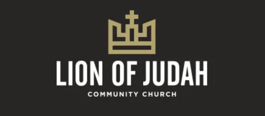
A crown and cross preach King Jesus without being loud or cliché. The two-tone badge looks good everywhere, from hats to signage. The design is clear and solid, visually declaring Christ-as-King in a way that feels both fresh and timeless.
- Clarity [9 / 10]: No squinting needed.
- Transferability [9 / 10]: Solid on hats, signage, and more.
- Honesty [9 / 10]: Christ-as-King, without cliché.
Hope Fellowship – 8.7 / 10
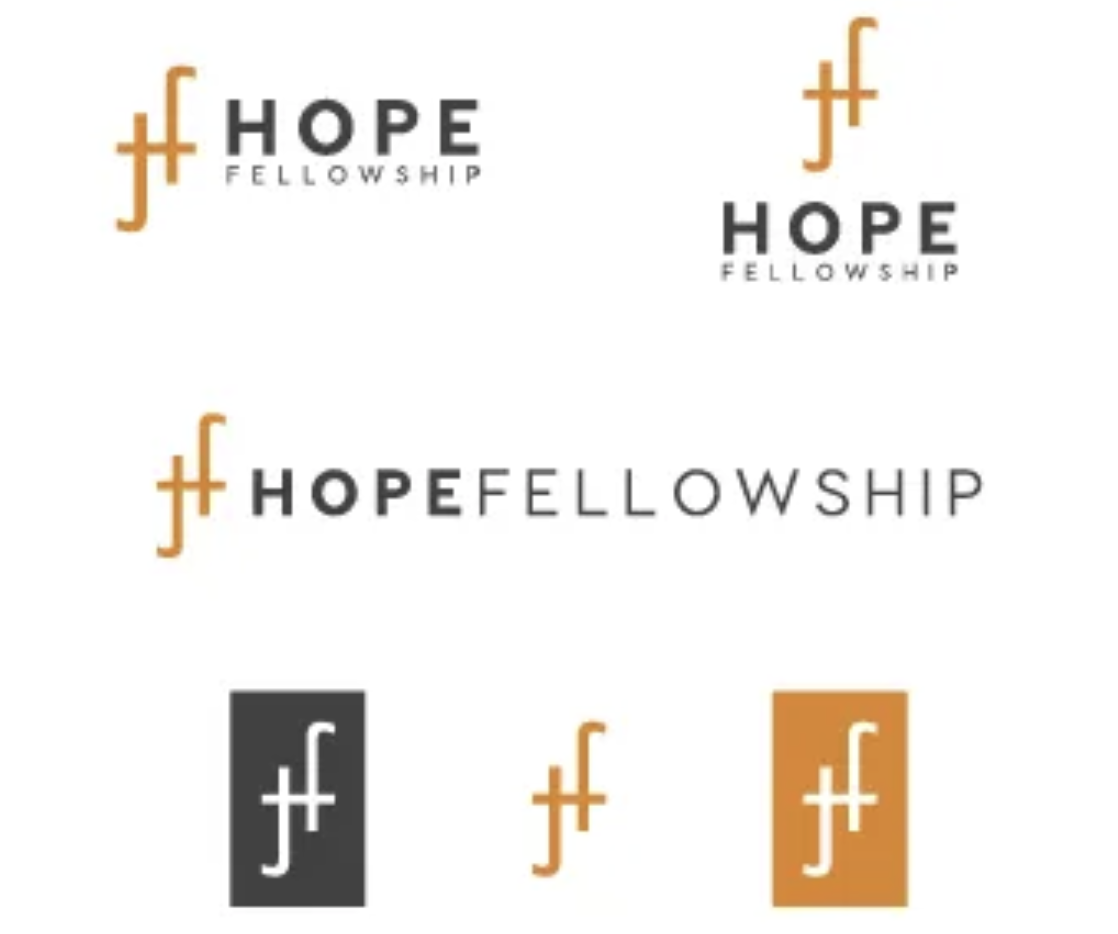
Ligatured Fs become a cross in a thin, elegant, and unmistakably church design. The logo holds up in foil, print, or embroidery, though it needs breathing room for the best effect. The one-stroke design shines and visually represents a grace-filled culture.
- Clarity [8 / 10]: Needs breathing room.
- Transferability [9 / 10]: One-stroke design shines.
- Honesty [9 / 10]: Grace-filled culture in visual form.
RiverStone Church – 9.0 / 10
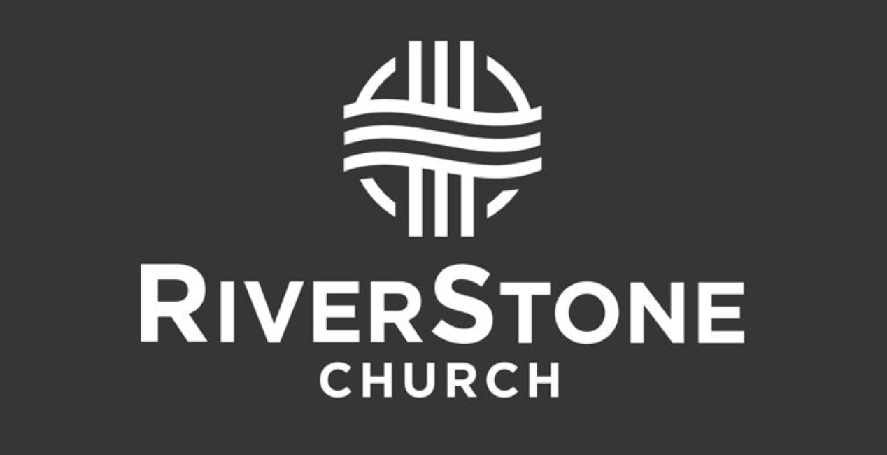
Rivers flow over stones, turning the church’s name into a memorable symbol. The clean weave looks great at any size, and the monoline design holds up anywhere. The natural metaphor fits the mission, making the logo both meaningful and flexible.
- Clarity [9 / 10]: Read in a glance.
- Transferability [9 / 10]: Monoline holds up anywhere.
- Honesty [9 / 10]: Natural metaphor fits the mission.
Center Church – 8.7 / 10
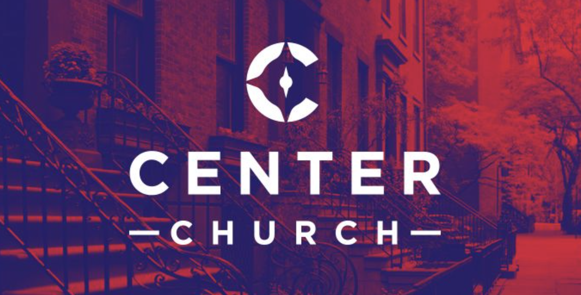
A diamond compass marks the cross at center, creating a tactical but warm visual identity. The compass and cross snap into place for clarity, and sharp angles work well. Small text needs space, but the mission truly lives in the mark.
- Clarity [9 / 10]: Compass and cross snap into place.
- Transferability [8 / 10]: Sharp angles work; small text needs space.
- Honesty [9 / 10]: Mission lives in the mark.
Bethel Gospel Chapel – 8.3 / 10
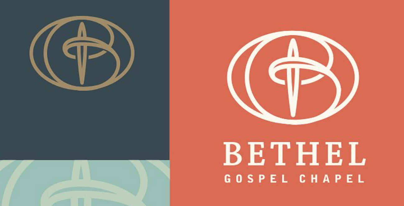
A fish wraps a cross in one motion, modernizing a classic symbol for today’s needs. The design needs medium size for detail, but foils and stitches cleanly. Gospel roots are visualized with restraint, keeping the logo both classic and fresh.
- Clarity [8 / 10]: Needs medium size for detail.
- Transferability [9 / 10]: Foils and stitches cleanly.
- Honesty [8 / 10]: Gospel roots visualized with restraint.
Bridgetown Church – 8.7 / 10
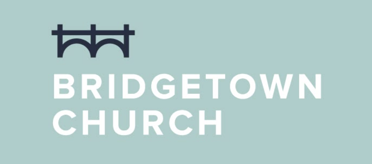
Twin rail bridge spans both literal and figurative gaps, with a pastel palette that softens the feel. The rails are clear, though pastel colors dim at small use. Simple lines scale up or down, and both Portland and connection show up in the design.
- Clarity [8 / 10]: Rails clear, pastel dims small use.
- Transferability [9 / 10]: Simple lines scale up or down.
- Honesty [9 / 10]: Portland and connection both show up.
Gateway City Church – 8.3 / 10
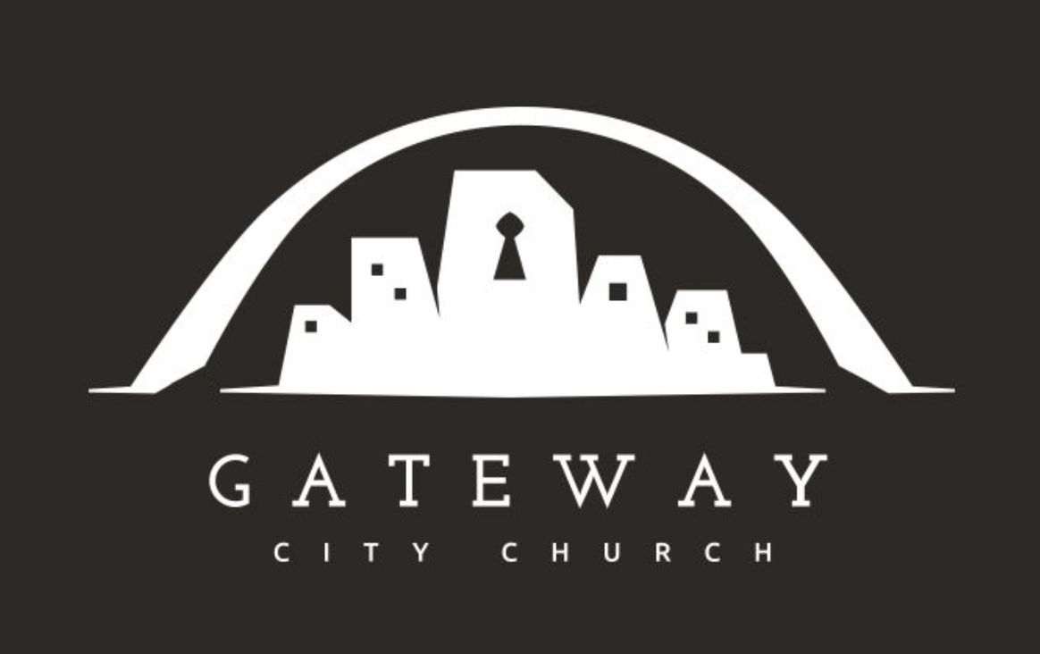
A city skyline frames a gateway keyhole, combining mission and place in one motion. The logo looks great in dark mode too. The arch needs a bit of size to shine, but the chunky arch works and the visual welcome matches the church’s name.
- Clarity [8 / 10]: Arch needs a bit of size to shine.
- Transferability [8 / 10]: Chunky arch works; skyline gets tight.
- Honesty [9 / 10]: Visual welcome matches the name.
Cross Pointe San Francisco – 8.7 / 10
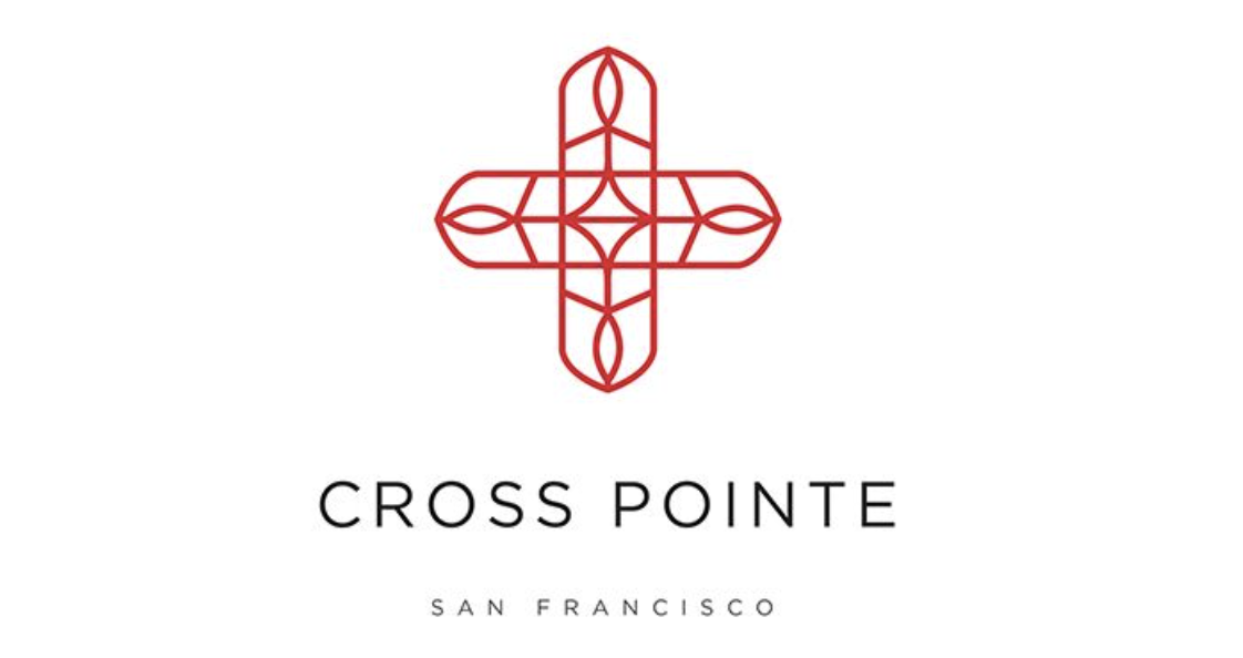
A lattice cross maps a city grid, blending faith and place in one image. Burgundy adds warmth without losing clarity. Grid and cross are instant, even lines work everywhere, and the city metaphor is solid, though slightly abstract for some viewers.
- Clarity [9 / 10]: Grid and cross are instantly recognizable
- Transferability [9 / 10]: Even lines work everywhere.
- Honesty [8 / 10]: City metaphor solid, slightly abstract.
Oasis Community Church – 8.7 / 10
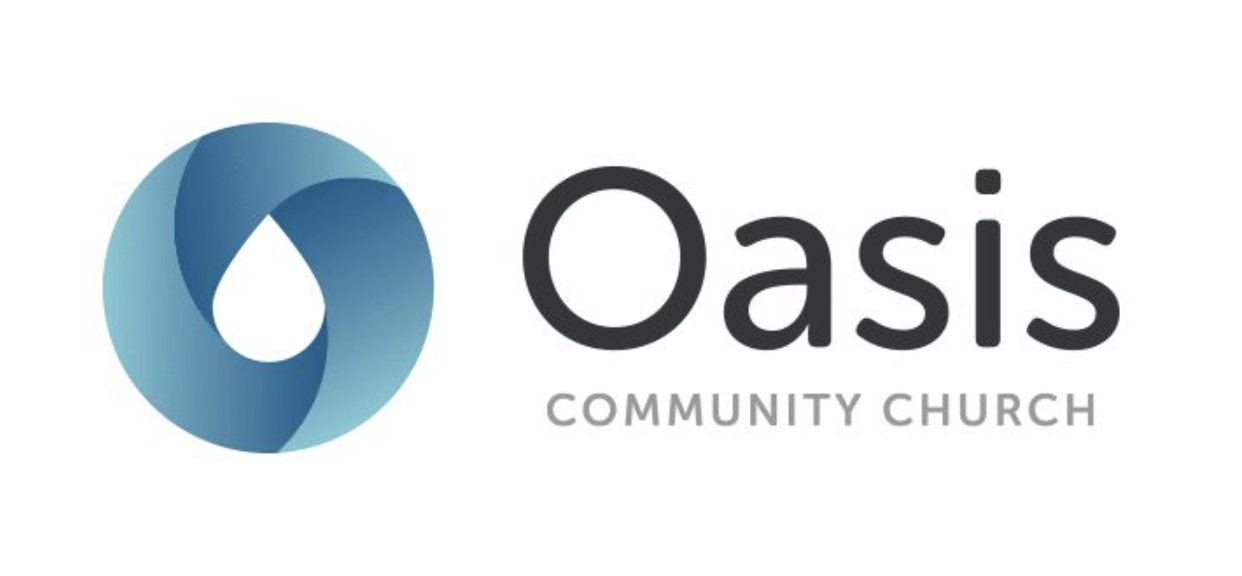
A swirling droplet forms a peaceful pool, with the logo reading refreshment whether flat or in gradient. The eye catches it instantly, and it reproduces well in every format. Oasis promise is clear, though the faith link could be stronger visually.
- Clarity [9 / 10]: Eye catches it instantly.
- Transferability [9 / 10]: Reproduces in every format.
- Honesty [8 / 10]: Oasis promise clear: faith link less so.
Lifeline Community – 8.3 / 10
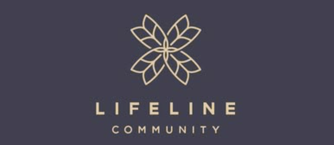
A petaled icon suggests life, rhythm, and growth, with linework that feels open and modern. Thin lines merge when small, so embroidery needs a thicker pass. The restoration vibe shines through, making the logo both inviting and meaningful for the church.
- Clarity [8 / 10]: Thin lines merge when small.
- Transferability [8 / 10]: Embroidery needs a thicker pass.
- Honesty [9 / 10]: Restoration vibe shines through.
Church Logo FAQs:
1 How do I know if my church logo is unique enough?
Start by searching for other online churches or church logos in your area and denomination to see what’s already out there. A unique logo should stand out at a glance and not be easily confused with others. Look for distinct shapes, symbols, or color combinations that reflect your church’s personality. If it feels familiar or generic, keep refining.
2) What file types or formats should we ask for from a designer?
Request your logo in several formats: vector files like .AI or .EPS for printing, and .PNG or .JPEG for web use. Vectors let you resize the logo without losing quality, which is important for banners or shirts. Ask for both color and black-and-white versions. Make sure you get the original files, not just images, so you can use them for future needs.
3) How often should a church consider updating its logo?
There’s no set schedule, but a logo should last for years if it’s well-designed. Consider an update if your church’s mission, name, or style changes, or if the logo feels dated compared to other materials. Sometimes a simple refresh—like tweaking colors or fonts—can bring new life to your church marketing, without losing your history. Listen to feedback from your community before making big changes.
4) Can we use a free online logo maker, or should we always hire a professional?
Curious about how to make a logo? Free logo makers are a good starting point if you’re on a tight budget or just want to try ideas. However, a professional designer brings experience and can tailor a logo to fit your church’s unique story and needs. If possible, use a free tool to brainstorm, then work with a designer to polish your favorite concepts. The investment often pays off in the long run.
5) How do we get honest feedback on a logo before making it public?
Share your logo drafts with a small group from your congregation, including people of different ages and backgrounds. Ask for their first impressions and if the logo feels true to your church. You can also test it in different places—like on a bulletin or t-shirt—to see how it holds up. Honest, early feedback helps you avoid surprises later.
Your Logo Won’t Build Your Church…
(but it’ll help people remember it!)
Look, none of these great church logos are perfect. But they work—because they tell the truth about the churches behind them. So, with that in mind:
Take what’s helpful, scrap what’s not… or in the words of an apologetics prof I had in Bible College:
“Eat the chicken, spit out the bones”. Thanks Dr. Hardock.
Need help picking a direction?
Grab some folks from your team. Pray about it. Then look at this list again with fresh eyes. And if you’re feeling bold, shoot us your design on instagram. I’d love to see what you’re cooking up!