
14 Examples Of Church Logos To Inspire Your Own


When you drive or walk by a church you’ve never seen before, what’s the first element of it that catches your eye? If I had to guess, you’d likely say either the church building or the logo. While I can’t necessarily assist you in picking the right building, I can give you 14 examples of church logos.
Church logos are often forgotten or throwaway parts of a church marketing strategy. Many churches will even use the same logo that has been used for the past three decades and leave it at that. But your logo can inspire, catch attention, and even intrigue newcomers enough to check out your church, if done right.
It’s for these reasons that you want the first impression someone has of your church to be a welcome one. To help you with this, I have 14 examples of excellent church logos below that, hopefully, inspire you to do something equally impressive.
What Is A Church Logo?
Before you take a look at the church logo designs I have for you, let’s break down what a church logo is. A church logo is the image that represents your church brand. The logo is that image that you put everywhere. It’ll go on the sign outside your church; on the building itself; on shirts; posters; social media posts on Twitter, Instagram, and Facebook; and more.
A church logo is, at its core, just an image. But it isn’t any old useless image; it is the representation of your church in a visual format. It is one of the most important parts of determining your church’s brand image and what your style is.
What is the Purpose of a Church Logo?
There are a few purposes for a church logo, and it isn’t just to have something cool for people to look at when they drive by your building. The goal of a church logo is to catch someone’s eye. You want something colorful and fun to look at.
You want someone to stare at your logo and think about why it is so impressive and exciting to stare at. The goal is to get someone intrigued enough that they want to find out more about your church, be it walking through the doors or checking out your church website.
The other purpose for a church logo is to create your church brand image. Every church that wants to be ready for the modern digital age should have a true marketing strategy and cohesive brand.
This strategy all starts with your logo, which should have colors, patterns, and a style that is thoughtful and present throughout everything you do and make. The logo is the basis for which you create that church branding. Everything else should branch off of it and people should instantly recognize your logo and style.
Someone should see your logo or colors somewhere and instantly know your church is involved because your logo has established a dedicated branding that represents who you are and your brand identity.
14 Examples Of The Best Church Logos
Here, you’ll find 14 of my favorite church logos in existence. I tried to go broad and take a look at all sorts of logo ideas for many different types of churches across the world. I tried to have some that are rather plain and simple (but still impressive) while also having more modern and extravagant logos.
I’ll explain what I love about these logos and how you can take their ideas, and create your own memorable design using a logo maker or your graphic designer.
See more of the best church logos here.
1. Red Rocks Church

Starting out the list is Red Rocks Church, which has a solid and streamlined logo. You have the name of the church in a basic and unassuming font, plus a tiny image of the mountains next to it. Overall, this doesn’t do anything too wild but it doesn’t need to.
This logo is the prime example of cohesive branding. That same logo is used for the other aspects of the church, such as the Amphitheatre in Colorado that the church often uses. Even still, there is room for improvement, like the all-caps text, which I don’t love.

2. Victory Christian Fellowship
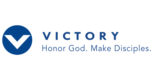
When it comes to one of the cleanest logos on this list, I would put this one near the top. This church in the Philippines nailed a modern and appealing font with the right blue color choice.
What elevates this one is its small motto at the bottom that instantly lets you learn a bit about what the church is there for: honoring God and making disciples of the congregation.
3. Church of the Highlands

The Church of the Highlands doesn’t do anything too special, but that doesn’t have to be the case. The font for the words is attractive and simple. But the real star is the idea that I think a lot of churches could take, which is creating your own unique image to represent your church.
In this case, it is a triangular image that features a sun over the highlands. You could make your own similar image whatever you want it to be, but bonus points if it matches your church name.
4. Saddleback Church

Saddleback Church in Southern California is another example of the less is more idea for a church logo. If you insist on the all-caps idea, this is a great example of a font to use that is easy enough on the eyes.
In addition, I like the logo image on the side that can double as a recognizable image to put on everything, including church merch.
5. North Point Community Church

North Point has plain white text that contrasts nicely with the darker and more colorful side image in the logo. This image perfectly captures the name of the church, appearing like a compass and showing it facing north, just like the church is there to help point the church members up to God.
6. Free Chapel

Free Chapel’s logo text is okay, but I’d mainly like to point out the image here. Like the others on this list, your logo image can make or break your church. It has an “F” like in the name but it almost has a cross-like style to it, giving it a dual purpose.
You could take this to make your own cross logo or a Bible one.
7. Angelus Temple

I should note that I used to be employed at this church in Los Angeles, but I still adore the logo. It is all lower-case, which I would change, but this simple text keeps it uniform and clean. The logo image is also great, having an “A” for the name it also appearing super stylized.
8. Grace Vancouver Church

When it comes to the most extravagant and busy logo on this list, it might be this one. I adore the set of images that immediately help you understand this church. Its catchy message of “upward, inward, and outward” is terrific and clear here.
Without even looking more into or attending Grace Vancouver Church, I feel like I already know a fair bit: they believe in looking upward to God, inward for the church members to grow, and outward to then take that growth and apply it to the rest of the world. I love how informative this logo is.
9. Metro World Kids
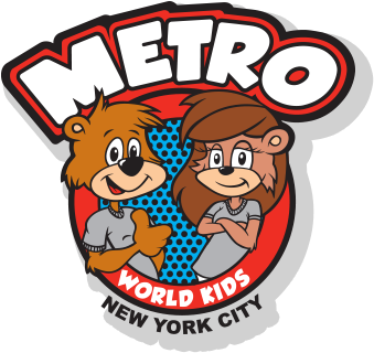
I wanted to include a children’s church logo, so I like this older, more traditional one from Metro Ministries in New York City. It is colorful, eye-catching, and features some cute cartoonish characters. While I would make it a bit more modern, this is a nice basis to customize your own kids-themed logo.
10. Elevation Church

Elevation Church’s logo image is a bit basic, but it is clean at least. The main reason I like this logo is the text. The creator of it knew to emphasize the Elevation part so your eyes are drawn to it.
Bonus points, too, because that font is used in everything on the church website and branding, which is what you should do.
11. Dream City Church

The logo text for this church in Phoenix, Arizona, is a bit outdated in its feel. That said, what I love is its image. It’s probably my favorite out of any on this list, showing a kid looking up toward God in wonder, while also being in the shape of a “D” for Dream City Church. It gets so much done in such a tiny image.
12. Eagle Rock Baptist Church
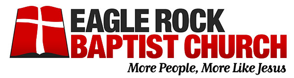
This is one of the oldest-looking styles of a Christian church logo on this list. Even still, there is something to love about the flashy logo color. The red, white, and black font is more daring than others, which I appreciate. I would like to see more churches inject some color into their logos.
Plus, I like how this logo concept packs so much into it, including the church’s name, motto, and a logo image.
13. Zoe Church
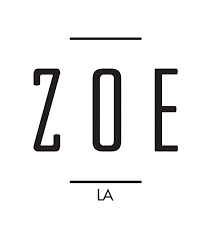
I can tell you whoever made Zoe Church’s logo is likely a talented marketing or graphic designer. You can look at this and not even realize this is for a church, which is a good and bad thing. But what I can say is that it is highly mainstream, like what you would see from a professional business and a modern church logo.
This is a logo designed to stick in your head, appeal to the viewer, and be plastered all over church merchandise, business cards, t-shirts, and the like.
14. Los Angeles Dream Center

I was also employed here in the past, but even before I worked there, I felt that the Dream Center’s logo was one of the best in the business. The Dream Center font plus the captivating “DC” image is memorable.
It’s so impressive that there are numerous other Dream Centers around the world that use the similar logo, making for a unified and outstanding way of staying fresh in everyone’s minds. This is how you make someone interested in your church or nonprofit ministry organization.
Make Your Church Logo A Marketing Foundation For The Future
Your church logo is the beginning—not end—of your church marketing strategy. It is the start of everything for your church, from its image to the style that everyone will know your church to be. But it doesn’t stop in the slightest with your new logo.
You have to take this firm foundation and build upon it into something unified and representative of your church’s image and ideas. You could even argue that the logo is one of the easier parts since you now have to build a team, create plans, and execute ideas both offline and online that will get your church’s name out there. Find out how to make a church logo here.
Thankfully, you aren’t alone in this. Ashley Vaughan previously broke down what church marketing is, and this is the place to head next. Also, be sure to subscribe to The Lead Pastor newsletter so you don’t miss out on any future content that can further build upon your current foundation.
