Great church bulletin ideas do more than just fill a page—it’s about connecting with your congregation in meaningful ways. Yet, without thoughtful planning, church bulletins can cause unexpected frustrations:
- Important announcements get overlooked, leading to confusion or missed opportunities.
- Design and layout issues make the bulletin feel cluttered or unappealing.
- Congregants feel disconnected when the content isn’t engaging or relevant.
These problems usually happen because we don’t pause to rethink the role of our bulletins in church communication. Are they just for sharing information, or could they inspire and strengthen your community?
That’s why I’ve rounded up these ways to improve your church bulletins. Whether you’re looking for fresh design tips or ideas for meaningful content, this list has something to help you create a bulletin that truly serves your congregation.
I’ll cover:
- What Is A Church Bulletin?
- What Should Be In A Church Bulletin?
- 8 Ideas To Improve Your Church Bulletin
- 7 Common Church Bulletin Mistakes To Avoid
- 3 Examples Of Church Bulletins
What Is A Church Bulletin?
The basics of a church bulletin is this: it is a pamphlet handed out to attendees as soon as they enter the church or sanctuary. It usually includes at least one page of information about the relevant events, announcements, Bible verses, and more for that week.
Usually, a church bulletin is changed every week, two weeks, or month to reflect the most recent information about the church. It is also one of the introductions for new church attendees, which makes it one of the most underrated elements of a successful church. It is essential for any modern church and shouldn’t be ignored.
What Should Be In A Church Bulletin?
For the most part, it is entirely up to you what you want to include in your church’s bulletin. At the bare minimum, it should include the name of your church, any relevant logo or branding, and some general information about what’s happening in the church and perhaps even your beliefs about God.
Many churches use the bulletin as a chance to share info about new events put on by church event management team, testimonies of what’s happened recently, announcements, and more. As mentioned earlier, the church bulletin is one of the first impressions that a newcomer to your congregation has.
Because a newcomer will sometimes flip through your church bulletin, many churches use this as a chance to introduce the pastors, location, social media sites, Sunday School, and what your church is all about. In a way, you might see it like a mini version of your church website but in a physical media form.
8 Ideas To Improve Your Church Bulletin
Church bulletins go so underused in churches around the world, when it can be one of the best tone-setters for newcomers.
In addition, it can be used to inform the regular church members and prepare them for what’s to come in the near future for upcoming events, such as an Easter worship service, fundraising opportunities, outreach events, and the order of service.
To help you with improving or even creating your first church bulletin, here are eight essential church bulletin ideas that I have used in the past and seen be quite successful in congregations. You can even use these as steps or a checklist to come up with a printed bulletin from scratch in a way.
1. Make the bulletin visually striking
The church bulletin is someone’s first impression of your church, so you want it to be an impressive and welcoming one. To this point, I suggest making your bulletin as visually appealing as possible. Use colorful and eye-catching headlines, fonts, and words that will entice someone to look through every page.
In this same way, you want to make it organized quite well so that the church attendee is encouraged to read every part of it.
2. Have your church’s branding front and center
A significant part of the visual style of the church bulletin is your branding. At this point, hopefully, you have a recognizable church logo (see some example church logos here and the best church logos here), name, and style. You want this to be constant across the board in everything you do, including your bulletin.
Someone should see the cover page of your bulletin and immediately connect it to the church sign outside, t-shirts selling in the foyer, etc. This cohesiveness is a must.
3. Include activities to engage your churchgoers
I won’t shy away from the harsh reality: many churchgoers completely ignore the church bulletin or only glance at it for a moment. It’s for this reason that I encourage churches to give your attendees a reason to keep looking at it. One way is through activities in the bulletin.
This could be something in the form of a Christian crossword puzzle, some trivia questions, a raffle for each person to fill in for a chance at a prize like a church shirt, or anything else you can think of. This is even a chance to include a space for maybe even kids to draw Bible scenes in the bulletin.
Sure, kids should be encouraged to attend the children’s services, but not every family, especially newcomers, are comfortable with that and bulletin activities can help keep kids quiet and occupied in the Sunday services.
4. Make the preacher’s message part of the bulletin
Speaking of activities, this is one aspect that is far more beneficial for the believer than a puzzle to pass the time. I adore when a church includes an outline or questions based around the pastor’s message to the church for the week.
The best versions of these have blanks for the attendee to fill out as the pastor goes through the message. Not only is it interactive, but it can act as notes for the congregation that can keep them much more invested in what is being taught in the service.
5. Encourage newcomers to get involved
A bulletin is one of the easier ways ensure your church's welcome is effective. I’ve noted before that one of the best ways to make a newcomer feel welcome is to provide a free service, such as a t-shirt for coming to hang out.
The bulletin can include a welcome connection card for newcomers to quietly fill out and optionally take to a welcome desk after the service, if they wish. The point here is to leave this as an option and not something forceful or that would bring too much attention to the new member. Get a church connection card template here.
6. Leave room for anonymous feedback
Speaking of keeping everything low-key, another intriguing aspect I haven’t seen much from churches is to have a page for anonymous feedback in the bulletin. Let people drop off the form in a box after church and give some comments about the service.
This is a great way to learn what is bothering members, such as perhaps the text on screen being too small to read, the music speakers being too loud, or just asking for an anonymous prayer request. These can mean more than you realize, especially if someone doesn’t have to reveal who they are.
7. Simplicity is key
One element that is tricky to balance is simplicity. It is somewhat challenging to know the difference between having a riveting church bulletin and one that has too much going on. In general, you want to be colorful but not go overboard where it is too hard to read. Clever use of white space can help with that.
In the same vein, only include a few words on each page in large font so that you don’t overwhelm anyone. Don’t go into too great of detail, but leave room for an email or person to contact for more info, if someone wishes to do so.
8. Create a modern weekly church bulletin
The old-school way of doing a church bulletin with a paper pamphlet in-person is totally fine, if improved in the ways I mentioned above. However, we are in a modern digital age and it would be a shame to ignore that. For this reason, I suggest having both a physical bulletin and digital option.
There are a couple of ways to do this, such as hosting it in the same spot on your website each week. Alternatively, you could include a QR code or URL on the presentation screen for someone to use to access the digital version.
This not only saves paper and gives more options—always a great thing!—but it can let you keep a record of all past bulletins (like you'd keep record of church tithes), which is quite nice for the history of your church.
7 Common Church Bulletin Mistakes To Avoid
In addition to the ways to improve your church bulletin, there are some mistakes you should 100% avoid. Here are a bunch of quick tips to keep in mind, as they could actually make your bulletin worse, not better:
- Avoid the mistake of filling up all of the blank space with content. Get your information across in a short and sweet manner.
- Don’t make your text too small. Keep those with poor vision (like me) in mind.
- Keep your page count to a minimum. You’re not trying to create an entire textbook; just a couple of pages are necessary here. In the same vein, be very careful with the church bulletin covers so that it catches attention but doesn’t waste space.
- Don’t sound like a robot. You want the language and wording to feel familial, welcoming, and encouraging to the reader.
- Don’t forget to include a Bible verse or two! This is a great way to incorporate a verse for people to pray on for the next week as they read God’s Word.
- Never share someone’s personal info without prior permission. For instance, you might want to include that a certain person is having a birthday or wedding soon so the congregation can congratulate them, but get permission first.
- Avoid all typos. This may seem like an obvious point but you still want to be professional and have high-quality work. Double-check your text and then have a fresh set of eyes look at it for mistakes you might, understandably, miss.
3 Examples Of Church Bulletins
There are many ways to make a church bulletin, just like there are many different churches out there. Check out a full set of free church bulletin examples. But I wanted to spotlight a few that I really appreciate and why that is.
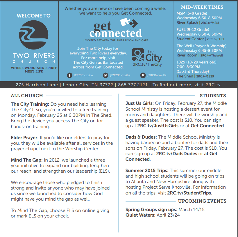
My favorite church bulletin templates start with this church bulletin from Two Rivers Church. The template has a bit too much busywork going on with lots of extra text, but the color scheme is nice and the information is fantastic. It has all the right makings of an excellent bulletin, such as services, what’s happening, and next steps for newcomers.

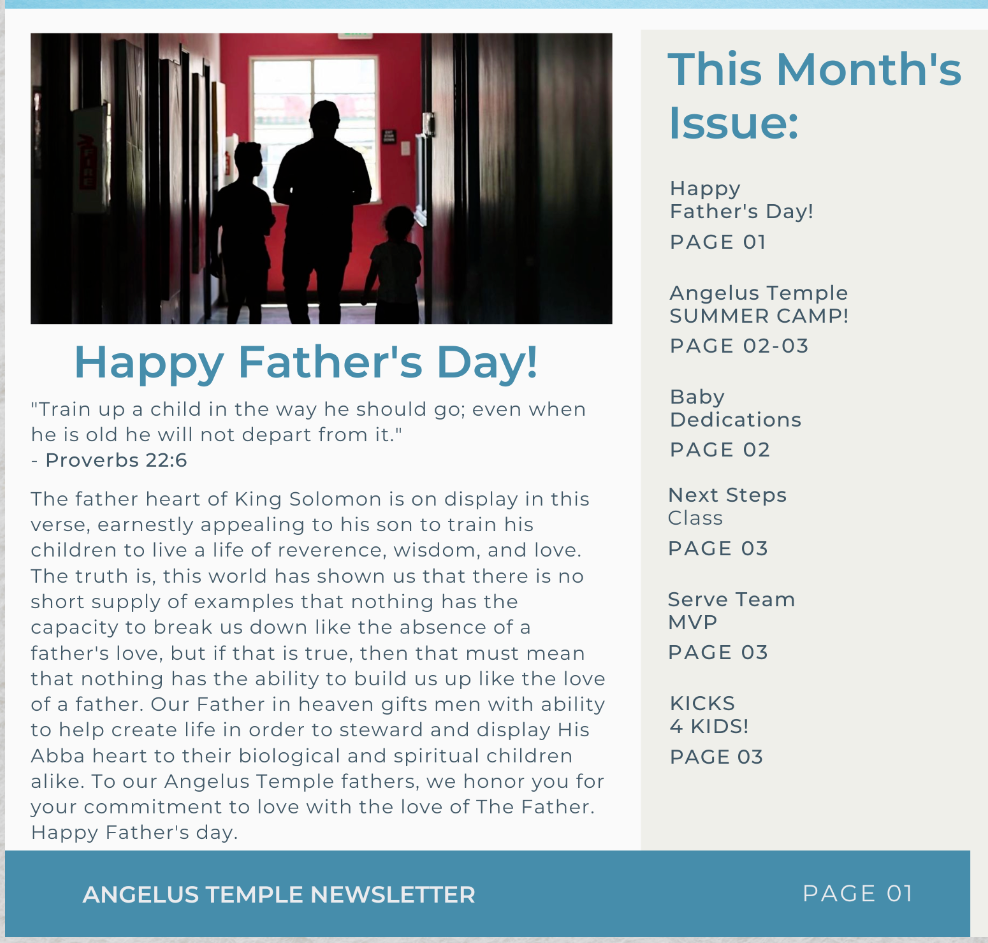
This next one (which I am biased about) is the latest newsletter from Angelus Temple, where I used to serve. The newsletter is quite close to the bulletin format for attendees, using effective fonts and colors to catch your eye. Plus, I appreciate the added photos that give nice context to the information.

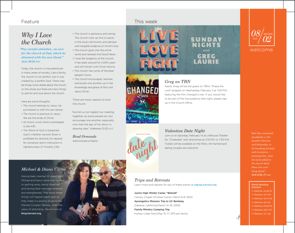
Lastly, there is this one from Harvest Christian Fellowship. There is a bit too much tiny text, which I would reduce, but it nails so many of the aspects I love. It has a clean visual look to its graphic design (their bulletin design template is excellent), introduction to the pastors, upcoming news, contact information, Bible verses to focus, a notes section for the message, and much more.

A Church Bulletin Is Just A Part Of Welcoming Attendees
The church bulletin is such an understated part of building your church communication strategy out. For many, it is simply a piece of paper you pass out every week at the church service and that’s it. But there is so much potential for the church bulletin, if you’re willing to go above and beyond what other churches are doing.
Newcomers to your church and even your established church members can benefit from the activities, church events, and information that your bulletin can offer, so it is worth using it to the fullest. Get more information about how to create a church bulletin here.
However, the church bulletin is only a single part of the welcoming process. There are many other ideas you could use, including for the church welcome speech, to build upon what the bulletin is doing. For more tips like this, don’t forget to subscribe to our newsletter for the latest breakdowns as soon as we publish them.


