These days, most people aren’t walking into a new church on a whim; they’re checking it out online first. They want to know the service times, what kind of events are coming up, and maybe even watch a sermon before they set foot in the building. That’s why having the right church website content ideas is essential
And I get it.
I’m not one to just stroll into a restaurant, hotel, or even a café without a little research first. I’ve usually scoured the reviews, scoped out the menu, and I’ve got a pretty good idea of the price range. That's just the world we live in.
Building impactful church websites with engaging content is the key to helping visitors and members alike feel welcomed, connected, and informed.
Confused? Frustrated? Not sure where to start? No worries - you're in the right place.
Thoughtful content does more than just fill the pages; it helps people feel connected and welcomed.
JOshua Gordon
13 Pieces Of Content For Your Church Website Needs
Creating a church website isn’t always easy, but a well-designed site (like church websites built with Squarespace) can be the perfect tool to showcase events, make online giving easy, and ensure that visitors find the information they need.

So, what pieces of content should your church website include?
1. Sermons and Media
Sharing sermons and media on your church website gives visitors a preview of your church's heart and message. It's a welcoming way for them to connect before they even walk through the door.
I love how Passion City Church has this right on their homepage:

As soon as you land on this site you’re greeted with vibrant visuals and striking typography that embody the church's energetic culture and expansive vision. Thanks to a straightforward top menu, navigating the site is a breeze. The “Start Here” page offers essential information for first-time visitors looking to attend services and get involved.
Tips + Best Practices
- Mobile-first media: Optimize for mobile playback so visitors can enjoy sermons on any device, wherever they are.
- Organize by Series: Group content into binge-worthy playlists by theme or series.
- Boost Accessibility: Add transcripts or captions to expand reach and improve your church's SEO rankings, helping more people find and engage with your message.
2. What We Believe
Grace Life Fellowship includes their 'What We Believe' statement in their section for new visitors. This is a great choice - and their layout is simple, clear, while still connecting readers with the heart and culture of the church.
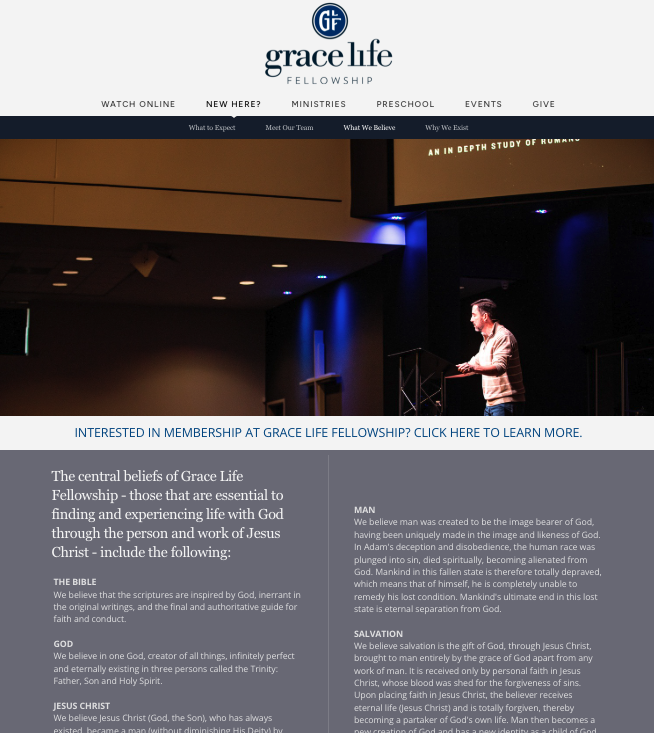
A “What We Believe” section helps visitors understand your church’s mission and values upfront—no surprises. Sharing core beliefs invites connection and builds unity around shared goals of outreach and growth, welcoming newcomers into the community.
Tips + Best Practices
- Keep it simple: Use clear approachable language to make beliefs easy for everyone to understand. Skip the “churchy jargon”
- Organize & Highlight: Use bullet points or short paragraphs to keep it readable, and include relevant scripture for context.
3. Events Calendar
I love the simplicity of the visual calendar I pulled from All Peoples Gathering Church. The site offers multiple ways to engage with the calendar, and

An up-to-date events calendar on your church website keeps everyone connected and shows newcomers there’s more than Sunday services here. It’s a simple, inviting way to encourage everyone to dive into the church community.
Tips + Best Practices
- Keep it updated: Refresh the calendar often so events are accurate and relevant, reducing confusion and missed chances for connection.
- Use color and simplicity: Color-code events by type (e.g., kids, youth, outreach) and keep descriptions brief to make the calendar visually engaging and easy to navigate.
- Add event details: Include essential info like times, locations, and descriptions, plus links for more details or sign-ups, making it easy for anyone to participate.

4. Ministries Information
At New Life Fellowship (where I'm on the pastoral team), our ministry teams page helps visitors understand how our church is structured and where they could plug in as volunteers!

Highlighting your church’s ministries can happen on your church about page, but make sure you do more than just list them—show your church’s heart in action.
Tips + Best Practices
- Organize Clearly: Group ministries by category (children, youth, outreach) for easy navigation.
- Encourage Engagement: Use inviting images and clear calls to action, like volunteer opportunities or contacts.
5. Online Giving Portal
Menlo Church has nailed online giving with a clean, straightforward setup. There’s no overwhelming info or text—just a simple, direct way to give. You can easily set up recurring tithes or make a one-time donation, keeping everything accessible and hassle-free.

Tips + Best Practices
- Make Giving Easy to Find: Place the giving button front and center on your homepage and menu.
- Offer Flexible Giving Options: Include choices like one-time gifts, recurring donations, and various payment methods.
- Keep It Simple & Secure: Use a quick, clear form and highlight security to build trust.
6. “What to Expect” Section
This is something that I would say is pretty new to church websites over the last 10 years and I actually think it's brilliant!
For first-time visitors, especially those new to church, knowing what to expect can ease nerves. So having clear details about service style, length, and programs like Sunday School help guests feel prepared, comfortable, and ready to connect.

Loft City Church absolutely nails their What to Expect Section. Not only do they greet visitors with a no-pressure, “everyone welcome” message, but they also offer a FAQ that covers some other things. From what to wear, to what kids can look forward to, and even how to get more involved with the community. Their approach is both thoughtful and inviting.
Tips + Best Practices
- Be Clear and Concise: Offer a straightforward overview of what visitors can expect before, during, and after the service, including parking details and directions.
- Use Welcoming Language: Maintain a friendly tone to help newcomers feel like they’re stepping into a warm and familiar environment.
- Include Visuals: Use pictures or short videos of your worship space and community to provide a visual preview that makes visitors feel more comfortable about attending.
7. Staff Profiles
While it seems pretty straightforward having a church leader bios or profiles page. Citizens Church really takes its staff profiles page to the next level. The photos are warm and welcoming, and the bios offer more than just job titles—they include personal testimonies.
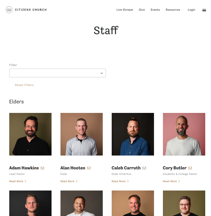
Once you click through each of the bios on Citizen's site, you get a great in-depth introduction to that individual.
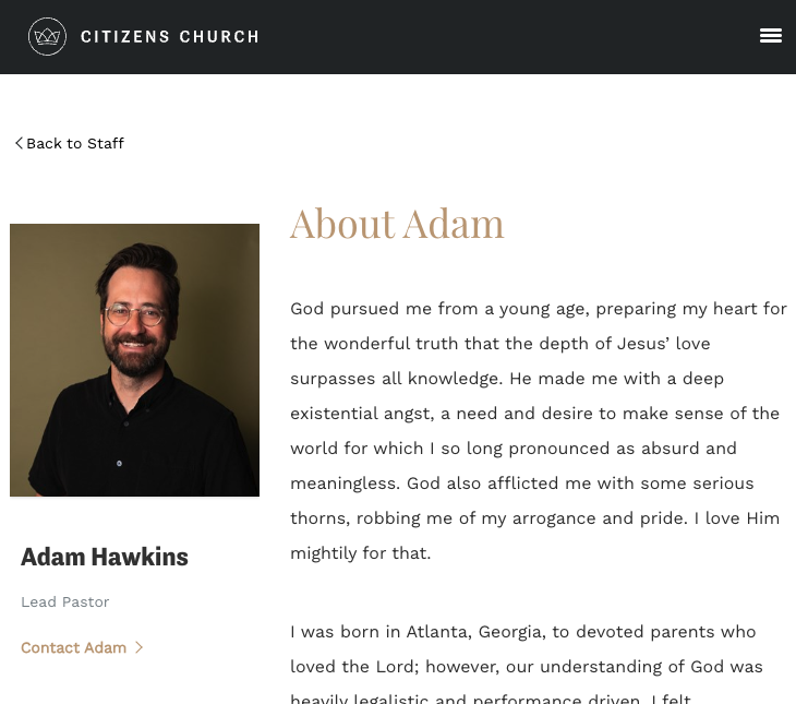
As an aside... one of my fave things about this example is that each staff member answers the question, “What is your hope for Citizens Church?” It’s an amazing way for visitors to connect with the heart of the leadership and see the church's mission in action!
Staff profiles on your church website are an opportunity to make your leadership team accessible and approachable.
This is key - visitors are much more likely to feel a sense of connection when they can put a face to the names of pastors and ministry leaders.
Tips + Best Practices
- Include Friendly Photos and Bios: Use approachable headshots and brief bios that highlight staff roles and interests.
- Showcase Personalities: Add fun facts or personal touches to make leaders relatable and engaging.
- Organize by Ministry: For larger teams, group staff members by roles to help visitors easily find the right contact.
8. Testimonials and Success Stories
Who doesn't love a good testimony? Featuring some testimonials on your church website or church blogs lets visitors see the heart of your community in action.
Here's a great example from LifePoint Church:

What I love is that these stories come from regular people just sharing what they genuinely love about the church. Honestly, after reading them, it makes me want to check this place out for myself! It's a perfect way to show a thriving, welcoming community that's real and relatable.
These shared experiences resonate deeply, showing a church that’s more than just a Sunday service—it’s a place for real growth and community.
Tips + Best Practices
- Share Real Stories: Highlight genuine, diverse experiences that show your ministry’s impact.
- Add Video Testimonials: Short videos let visitors hear personal stories, creating a warm connection.
- Update Regularly: Keep testimonials fresh to reflect your community’s ongoing growth and activity.
9. FAQ
I love how Passion City Church tackles the FAQ section—they go all sneaky by framing it as “What does a Sunday look like?” and sneak in answers to all the usual questions:

It’s a clever way to keep things casual while still making sure everyone knows what to expect. They answer the big stuff a way that feels like they’re just having a friendly conversation.
Create an FAQ section with newcomers in mind. Cover essential questions like “What should I wear?” and “Where do I park?”
Add practical info on service times, childcare, and ways to get involved. This way, visitors feel informed and welcome, making it easier for them to engage comfortably with your church community.
Tips + Best Practices
- Answer Common Visitor Concerns: Focus on questions a newcomer would ask.
- Be Clear and Concise: Keep answers short and to the point, avoiding jargon or complicated language to ensure clarity.
- Update Regularly: Make sure information like service times, event details, and seasonal changes (e.g., holiday services) stays current to avoid confusion.
10. Devotional Content
Adding weekly devotionals to your church website keeps members connected and engaged beyond Sunday. The Upper Room Church has a great approach with Bible Reading Plans for members to follow along.

When done well, this content reinforces the church’s message and offers a space to reflect on themes that might not fit into the Sunday sermon, encouraging community-wide reflection throughout the week.
Tips + Best Practices
- Simplicity is Key: Keep devotionals short and relatable, using everyday language.
- Themes are helpful: Align topics with current sermon themes for continuity.
- Call to Action: Offer practical takeaways to inspire weekly action.
11. Community Outreach Opportunities
Showcasing community outreach on your website lets visitors see your church’s commitment to serving others. Take a look at Cherry Hills Community Church:

Highlighting outreach programs reflects your church’s heart, making it clear that your mission goes beyond Sunday services, creating a community anyone would want to join!
Tips + Best Practices
- Use Engaging Photos: Depict the real experiences of serving.
- Highlight Volunteer Opportunities: Make it easy to get involved.
- Update Regularly: Keep events and needs current to encourage ongoing participation.
12. The History of Our Church
Whether your church is 50 years old or 5 months old, including a “History of Our Church” section lets visitors connect with your church’s journey. South East Christian Church nailed it (I especially love that timeline!). It’s clear, concise, and visually interesting with photos that keep my attention.

Tell the story of your church's roots, milestones, and the unique community it has built over time. Not only does this offer insight into your church’s values, growth, and vision, but it builds a bridge between past and present for both new and longtime members.
Tips + Best Practices
- Highlight Key Milestones: Share pivotal events, like founding dates or major projects, to show the church’s growth and impact.
- Keep Storytelling Relatable: Share brief, memorable stories that capture the church’s character without overwhelming visitors.
- Use Visuals to Connect Past and Present: Include photos of past events and present-day activities to show continuity and values that guide today’s mission.
Join The Lead Pastor Email List
Join the Lead Pastor Email List and connect with fellow pastors and church leaders who truly get the ups and downs of church leadership! You’ll gain valuable insights, share experiences, and find encouragement from a community that understands your journey. Don’t miss out on this opportunity to grow and be inspired—sign up today!

